Archive
New Media Timeline: King Oliver’s Creole Jazz Band, 1917-1923
I’ve always been fascinated with visualizations of historical events (action within time and space), and even more so with the failure of circumscribed media projects to adequately represent history.
Historical narrative is always artificial, and timelines compound this by being streamlined and projecting a linear clarity, which can obscure the messiness that underlies real events.
So (of course) I’m building one!
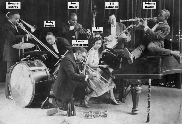
Timeline of King Oliver’s Creole Jazz Band (1917-1924)
I’ve finally decided to post about my in-progress timeline, which follows the development of King Oliver’s Creole Jazz Band (“KOCJB”) from 1917 through 1923, the year the band made 39 recordings which constitute “the first recordings of substance by an African-American jazz band [and] the most significant corpus of early recorded jazz” (Gene Anderson, U. Richmond).
While cornetist Joe “King” Oliver was an important pioneer of Hot Jazz in his own right, today he is remembered because his protégé was none other than Louis Armstrong, the most important (and best, IMO) musician of the “Jazz Age” (Armstrong’s period of seminal influence really extended from 1925 to 1935 or so, after which point his myriad innovations had been mostly incorporated into the Jazz landscape).
Armstrong played second cornet behind his mentor and idol Oliver from mid-1922 until August 1923 and on all 39 KOCJB records.
. . . there’s people all over the world, they like to hear that lead – ain’t no sense playing a hundred notes if one will do. Joe Oliver always used to say “Think about that lead.”
– Louis Armstrong on his 70th birthday
(paraphrased from Michael Steinman’s blog Jazz Lives)
The July-August 1950 issue of The Record Changer magazine was devoted to Louis Armstrong in honor of his silver jubillee (Armstrong believed himself to be born on July 4, 1900, though baptismal records show the correct date as August 4, 1901). Armstrong, a prolific writer himself, penned an article for the issue (pp. 22 & 45) celebrating the legacy of his mentor and father figure, Joe Oliver. This essay shows us the high estimation of and love for Oliver that Armstrong had. While his own recording career would eclipse that of Oliver, Armstrong never forgot Oliver’s musical contributions or those of the many other jazz musicians who came before him.

Armstrong, Louis. “Joe Oliver is Still King.” The Record Changer, Vol. 9, Numbers No. 6 & 7, July-August 1950, pp.10-11.
Joe Oliver has always been my inspiration and my idol. No trumpet player ever had the fire that Oliver had. Man, he really could punch a number. Fire—that’s the life of music, that’s the way it should be.
– Louis Armstrong (1950)
Scholarly Sources
My current bibliography (to which I need to add Floyd Levin’s book Classic Jazz among others), is here.
There are many great Jazz History sites on the web. To the enthusiasts among you I would recommend browsing the British Doctor Jazz site and Christer Fellers’ collaborative archive about trombonist and bandleader Kid Ory, The Kid from LaPlace. You also might check out the seminal Red Hot Jazz Archive website (though not updated since 1997 or so).
the accompanying RedHotJazz listserv has a lot of great contributors who discuss both 1920s artists and recordings as well as the many modern musical artists whose music takes inspiration from the “Hot Jazz” era.
Technical Notes
The Javascript tool TimelineJS, built for journalists by Northwestern University’s Knight lab, is the platform used to build the KOCJB Timeline.
This KOCJB project is shelved right now as I’m focused on other projects.
The timeline communicates what I’m trying to accomplish, but it’s unfinished. I should redo the introduction, add more details about the band’s California trip from May 1921 to June 1922 (there’s a lot of information), and write and end summary. The visual style is inconsistent as well.
I expect to continue refining the timeline, though who knows what web platform it will be on in a decade.
Thanks to John McCusker, Gene Anderson, and the entire wonderful community of Hot Jazz enthusiasts.
For modern explorations of early Jazz styles, make sure to check out the great Syncopated Times magazine.
– Andrew Taylor | September 19, 2014
Historic Map Compiling Project – Le Plan Scénographique de Lyon

– Gigapixel image of the compiled full map browseable in Zoomify viewer
– Side-by-side comparison of the 1548 map with five historical derivatives
– High-resolution 3D (bird’s-flight) video tour of the full map
In January 2014 I digitally optimized and compiled the 25 separate sheets that together make up “Le Plan Scénographique de Lyon vers 1550,” a huge, highly-detailed, 16th-Century axonometric (bird’s-flight view) map depicting the French city of Lyon cc. 1544-53 CE. Since then I’ve been working to understand and contextualize this curious historical artifact, and this essay is one product of that effort.
The Archives municipales de Lyon holds the only known copy of the 1550 Plan Scéno (as I’ll call it here, though many of the preparatory drawings likely date to 1544). In 1989 preservationist and paper expert Michel Guet dismantled and restored the map. This involved detaching the 25 sheets from their paper backing and each other as well as removing the remnants of earlier flawed restoration efforts. In 1990 the Lyon Archives published photographs of the 25 separated and restored map sheets along with an accompanying volume of scholarly essays (later augmented with a second set of essays). All of the essays from the project were hosted on the Lyon Archives’ website for years and are still accessible via the Internet Archive’s Wayback Machine. If any photographs exist of the plan taken before Guet’s 1989 restoration they have not been published by the Lyon Archives.
The map segments are to be arranged for viewing in a 5 by 5 grid starting from the top left, each segment being overlapped by the segments to the right and below it. Because each segment of the published map is larger than the flatbed scanner I used, I originally scanned each segment in two parts at 600 ppi, combined them, and then reconstituted the full map using Adobe Photoshop (info tooltip | link).
Viewing the map’s 25 segments separately, it is very difficult to effectively view or even fully conceptualize the map in its totality, as a single composition. To redress this I determined to compile the 25 map segments into one contiguous digital image. I should note that significant image adjustment (aka warping) was required in some areas to insure that the segments line up logically and so the final product would appear seamless. You’ll notice that the bottom-right cartouche is slightly lower than the one on the lower left. This may not be a characteristic inherent in the original, but could reflect the digital processing – I mostly compiled each row of sheets starting from the top-left, following the original numbering of the 25 sheets, and therefore the bottom-right sheets were the last added to the composition.
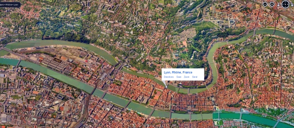
For modern viewers, the faux-aerial perspective used for pre-modern axonometric city maps is strikingly similar to the satellite-derived views provided by modern online map services (though the top of the the 1550 Plan Scénographique is primarily directed west-southwest, not north). For comparison, below is a high-contrast screenshot of Bing maps’ “Bird’s Eye view” of modern-day Lyon (facing west) compiled from multiple aerial photographs taken at an oblique 45-degree angle (unfortunately this bird’s eye view is now only available via the Windows Maps desktop app – AT 02/21)).
Note that the modern shape of central Lyon is significantly different from that shown in the 1550 Plan Scénographique. This is primarily because of the largely-industrial Perrache neighborhood, extending South (left) of the highway in the modern center of the Presqu’île (peninsula), which did not exist in the 16th century. Perrache was developed from 1779-1840, incorporating southern marshland and small islands into the peninsula and moving the confluence of the Saône and Rhône rivers further downstream (source). In the sixteenth century, these low-lying islands were repeatedly flooded, destroyed, and rebuilt by the rivers. Only the edge of the area now covered by Perache is shown on the 1550 Plan Scéno, an island labelled “[BRO]TEAUX D’ENEY” in reference to the nearby Abbaye d’Ainay. I haven’t attempted to recreate how Broteau D’Ainay might have looked in 1548, but it can be seen on Philippe Le Beau’s 1607 Lyon map (optimized detail view with label indicated). Source: archives municipales de Lyon.
See Gauthiez (2010) for more on Perrache and the confluence and Arlaud (2000) for much more on the Presqu’île.

Lyon Topographic Plan, 1544 & 2015
The animated map above is an augmented “mashup” incorporating three sources –
- A blueprint of Lyon in 1544 (identified as a/the main year during which the Plan Scénographique’s survey drawings were made) adapted from a Flash presentation accompanying the Lyon Archives’ 2009 exhibit Lyon 1562: Capitale Protestante (B. Gauthiez) superimposed on
- Geoportail‘s amazing elevation map (“Carte du Relief” layer, unfortunately there was no altitude legend), facing west and extended North and South, and
- a 2015 satellite image exported from Google Earth Pro.
An observation about the above GIF – I originally labeled the top-right neighborhood (quartier) around Le Couvent l’Observance “Vaise.” Vaise is actually the name of the faubourg (suburb) located outside Lyon’s northern city gate (“Porte de Vaise“), situated on a plain north of l’Observance and west of the Saône river which was mostly farmland in the mid-1500s. During the 16th century the area around l’Observance was named “Le clos des Deux-Amants” after a Roman-era funeral monument shown on the Plan. (source: Les Cordeliers de l’Observance á Lyon, par L.A.A. Pavy et [C.] Tissseur, 1836, pp.6-11).
Click here to see the area on the digital Plan Scéno (top half of sheet 10), and from there you can switch to the 1698 and 1876 derivative maps (select from lower-left pulldown menu) to see the now-missing part of the 1550 Plan Scéno showing the approach to Vaise.
Where Lyon ends and Vaise begins is confusing because it changes over time. As Lyon grew northward the city would build a new city gate and absorb the part of “Vaise” located south of the gate. In 1550, the city gate labeled the “Porte de Pierre-Scize” on the 1550 plan was the northernmost city gate of Lyon and was sometimes referred to as the “Porte de Vaise.” In 1580, another gate was built at a point just north of the edge of the 1550 plan and this gate becomes the “Porte de Vaise” (it would also sometimes be called “Porte du Lyon” or “Porte neuve du Pont Levis” (source).
This annotated detail taken from LeBeau’s non-derivative 1607 map of Lyon extends further north than the 1550 plan and shows more of Vaise (a half-century later):
“Why not georectify the Plan Scéno, since we know where most of the represented landmarks were located, maybe even all of them?”
Because the map is far from spatially accurate. The area of the W-SW-facing map overall appears to be significantly stretched N-S (the X-Axis) compared to the real-world dimensions. This uneven stretching is most notable in the bend of the Saône river as it rounds the central hill of Fourvière, which is far less sharp than in the real world. This may have been deliberate artistic license rather than a mistake, as the elongation allows the cartographer more left-right room to include location-based labels and imagery, particularly along the densely-settled banks of the Saône. It also would reflect the viewpoint of an artist situated on the hillside of La Croix-Rousse, looking south across the Saône towards Château de Pierre-Scize making preparatory sketches. Scholars have also observed that while many buildings had as many as five or six floors, the map shows no building as having more than four.
While I do believe that the 1550 Plan Scéno de Lyon achieves verisimilitude as a portrait of the city (achieves the appearance of spatial accuracy), it’s building imagery is not completely reliable, and both its scale and compass directionality are wildly inconsistent.
This plan was drawn up by calculating angles from certain heights, particularly church towers such as that of Saint-Nizier which, located on the peninsula, has often been used for this purpose. These calculations were then compared with distances on the ground, measured by using a knotted rope or by counting the number of steps…in the geometric center of the plan was the ditch, drawn according to a scale of 1/824. All around, everything is out of proportion in order to include certain elements considered essential. If the [1/824] scale had been used throughout, the plan would have been 3.5 times bigger!
—Musée Gadagne, A plan depicting scenes of 16th C. Lyon, Inv. N 1675
Geographer and urbanist Bernard Gauthiez, the de facto topographical biographer of Lyon for the past twenty years, expressed it to me thus:
“Georectify[ing] the 1544 plan [is] like mapping the Near East from the Bible… Several scales are used, and it has not been drawn from a measured survey. See my paper on it.”
Professor Gauthiez’ work on Lyon (along with the Archives Municipales’ 1990 publication) is an authoritative modern source for many of the ideas I am exploring regarding the topography and urban development of pre-modern Lyon. The essay part of this Lyon project simply documents a new media technologist’s (my) second-hand efforts to understand, consolidate, visualize and popularize ideas that have already been rigorously developed and explored by expert scholars utilizing primary source materials. Much of that material is held in archival repositories, has not been made available on the web, and might only be fully comprehensible to experts regardless.
The making of Le Plan Scénographique de Lyon c.1544-1550
One of the intriguing aspects of the 1550 Plan Scéno is that the 25 segments were printed using negatively-etched (Intaglio) copper plates, and those etchings were themselves compositions based on original survey drawings. Thus the 25 map sheets are copies of copies created through a process of mechanical reproduction. Neither the original survey drawings nor the copper engravings exist today, and while it is conceivable that other copies of the map were printed, this is the only known copy.
– Jeanne-Marie Dureau, Archiviste de la Ville de Lyon,
Introduction to Le Plan de Lyon Vers 1550 (1990)
The sheets were printed on “laid paper,” made by pouring paper pulp (made from linen or cotton) into a wire frame to dry. The Lyon Archives have identified the paper manufacturer’s shaped-wire watermark on some sheets, representing a bunch of grapes.
Creation date
The extant portions of the 1550 Plan Scénographique are undated and unsigned, but researchers have determined that the map was most likely created within the 8-year period between late 1544 and Spring 1553. It is likely that the principle survey drawings were created in 1544 (Gauthiez, 2010), but many features were added that are from a later period.
Here’s some date evidence that I was able to verify:
- In the top right of the map (sheets 4 and 5) workers are depicted building a new fortification, “c’est le boulevard de la Pye ou citadelle” (Grisard 1891, p.31). Gauthiez estimates that the map represents the progress of work on the new walls in approximately 1545.
- On sheet 6 is depicted a “jeu de paume” (early tennis) court decorated with Henri II’s crescent symbol and depicting four figures playing with rackets. This suggests that the map was worked on shortly before the Royal entry in September 1548 to celebrate Henri II’s coronation. According to Oxford scholar Richard Cooper, “late in June the order was given by [Governor of Lyon] Jean de Saint-André (for the construction of a new jeu de paume at Ainay on land bought from the abbot, Cardinal Gaddi)” (Cooper, p. 18, and Cooper’s source in the Lyon archives).
Ornamentation
The map’s ornamentation clearly follows the Fontainebleau tradition (essay in Heibrunn Timeline of Art History). The symbolism of the map is neoclassical rather than biblical, reflecting the Renaissance infatuation with classical imagery. It may also reflect an anti-clerical sentiment within Lyon’s secular aristocracy (Cooper, pp.3-5).
Through this project I have become something of an amateur enthusiast on 16th-Century French engraving – it doesn’t hurt that so much of it is now available online (hyperlink list) to augment Library holdings.
Symbolism
For a detailed analysis of the Plan Scéno’s symbolism and the messages it communicates, see Gérard Bruyère’s 1990 essay Notes sur les ornements du plan de Lyon au XVIe siècle, published as part of the Lyon Archives’ 1990 project. The symbolic elements can be viewed on the digital version of the plan (e.g., in the upper left, the Royal arms of France and Auster, the South wind).
Attribution
Little is known about the lives of even the most famous engravers of the 16th Century, the main evidence is in the art itself. Based on observation and the assistance of scholarship, here is a list of possible candidates for participation in the project, artists who may have had both the ability and opportunity to create the ornamental art of the 1550 Plan Scéno de Lyon, in approximate order of likelihood. Perhaps multi-spectral imaging analysis will someday reveal more information indicating who the artist(s) might have been.
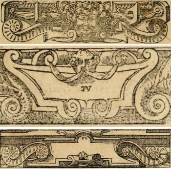
Cartouches from Alciato’s Emblemata (Lyon 1550), signed “PV” by Eskrich (for “Pierre Vase”)
- Pierre Eskrich, alias Pierre Vase, alias [Pierre] Cruche could have been the principal illustrator of the 1550 Plan Scénographique de Lyon both for the ornamentation and the map itself.
A Parisian who moved to Lyon around 1548, Eskrich created the woodcuts for a highly influential version of Andrea Alciato’s Emblems (a veritable cartoucherie published in Lyon in multiple editions from 1548-1551). Of equal interest is that in 1575 Eskrich engraved a map of Paris based on the Truschet-Hoyau 1550 plan (the Truschet-Hoyau map is discussed later in this essay). Eskritch’s Paris map was published in Francois de Belleforest’s La Cosmographie Universelle de tout le monde (Lyon 1575), a translation and update of an earlier Cosmographia by Sebastian Münster. Belleforest’s book also contains cartouches stylistically similar to those shown here from Alciato’s Emblemata. Other engravers contributed to La Cosmographie – for instance the contained Portrait of Lyon is credited to Antoine de Pinet, not Eskrich. - Georges Reverdy. “GE Reverdinus fecit”? Many scholars, notably Gérard Bruyère, have attributed the ornamentation (at least) to Reverdy, and Bruyère discussed why in depth. See Notes sur les ornements du plan de Lyon au XVIe siècle (1990).
- Étienne Delaune aka Stephanus. “Stephanus fecit?” He did a great deal of work (including goldsmithing) for and related to Henri II, and utilizes the king’s crescent moon symbol extensively. His style with cartouches, grotesques and more is consistent with the ornamentation of the Plan Scénographique. The images below are only two examples among the many attributed to Delaune in the Victoria & Albert Museum.


- Sebastiano Serlio (recent article attributing to Serlio the design of the temporary theatre built for Henri II’s 1548 entry to Lyon). Serlio was definitely in Lyon 1549-1550 and his longtime patron Cardinal Ippolito d’Este, Archbishop of Lyon, organized Henri II’s 1548 entry to Lyon.
- Jean Mignon. There are many artistic similarities between Mignon’s work and the 1550 Plan Scénographique’s ornamentation, and like most of the engravings attributed to Mignon, the Plan is unsigned (although the missing edges might have included a signature).
- Jacques I Androuet du Cerceau. Androuet du Cerceau was more than capable of creating both the ornamentation and the map itself (perhaps too capable). The contemporaneous and somewhat-similar Vue de la ville de Lyon en 1548 is traditionally attributed to Androuet du Cerceau – could the 1550 Plan Scéno and the 1548 view both be his work? This intriguing possibility is undermined by Estelle Leutrat’s convincing argument that the attribution of the 1548 view to Androuet du Cerceau is highly suspect (source: Leutrat 2007 pp.99-101). Could the two works be by the same person regardless of whether it is Androuet du Cerceau?
- Domenico del Barbieri (Fiorentino)
- Bernard Salomon
- Antonio Fantuzzi
The Way of Saint James – Principal French Routes

I wanted to show and write about the above map visualization, which derives from one of my early Google Earth-based GIS projects (mostly created during Christmas week 2011). I put off posting about it until now because it was inspired by a class trip to France organized and led by one of our Rice Art History professors, medieval scholar Linda Neagley. Along with the GIS classes I took for THATCamp Texas 2011, digitizing Gothic architecture images for Professor Neagley was a big inspiration for my GIS experiments. Medieval pilgrimage also provided a natural target for GIS visualization in Google Earth. I’d put off mentioning my project as I was uncomfortable about focusing on Professor Neagley’s project, but she’s seen it recently and thought it was an interesting angle of perspective.
A major source of data and knowledge for this project was Peter Robins, a European pilgrimage enthusiast/expert and creator of The Walking Pilgrim website, “[his] contribution to the current interest in walking old pilgrim routes in W Europe. It is primarily about routes, both current and historical, which is my main interest. It’s not about spiritual guidance or any of the religious aspects of pilgrimage. It includes my routes database, information on medieval itineraries, plus my suggestions for routes to the ports of S England, and to the shrines of N Wales.”
The KML linestring data (the Ways depicted are “Real” geocoded linestrings, not drawn) my geovisualization uses do not all derive from Robins work per se, as there’s plenty of pilgrimage stuff on the web and it took some time before I realized that most of the best stuff I found was from Robins. Given the day back again the linestrings probably would all have come from The Walking Pilgrim, since a few months after I began Robins generously responded to an email and explained how to download his linestrings from his website. The route distances were also adapted from Robins routes database.
I had already managed to create kml linestrings for many of the routes from based on data from various other web sources, I believe the pre-Robins routes were: le Puy, Arles, Vézeley, Aragonés and Francés. Many derived from gr-info.com’s grande randonnée “Long distance Footpaths” website, for some reason they didn’t have an ideal Paris-Tours route. for the visualization shown here I included many of Robins other Compostela-directed pilgrimage routes as unlabeled dark-red linestrings, partially to show other routes but also because they evoke veins of Christ’s blood going toward Compostella, and mirror the Milky Way above.
Peter Robins pointed out to me that the modern hiking paths are unlikely to have been the medieval paths – modern highways are more likely to run over the routes taken in the “moyen age.”
Pilgrimage maps from books in the Rice Library collection
While digitizing images of medieval reliquaries (the elaborate containers, as opposed to the relics, i.e. bones, True Cross piece, etc.) from the Treasures of Heaven exhibit catalog in-house for Professor Neagley’s class, I noticed that the acompanying modern map of medieval pligrimage routes from the book wasn’t very detailed and I decided to go hunting for and scanning Camino Santiago (AKA Way of Saint James) pilgrimage maps in a systematic way.
UPDATE
This project is pretty much over now, partially because I don’t remember the organization of all the files. The KML (Google Earth) file became so complicated that it frequently became corrupted and required lots of maintenance.
I think people have to do projects to learn how to do something – working on this one taught me a lot about Google Earth’s strengths and weaknesses as a Geohumanities platform, and about what I might want to do going forward.
– Andrew Taylor | October 24, 2014
Google Earth map of medieval architecture images
Wanted to write about a successful (it works the way I meant it to) GIS project I did last January in which I georeferenced ~100 password-protected photographs of French medieval architecture and made them accessible through Google Earth and Maps. Here’s links to 2 versions of the map I generated, which publishes well to both the Google Earth web plugin and Google Maps as it utilizes only the Placemark and Balloon features.
If the sidebar menu of the Google Earth desktop version were necessary I would have had to replicate myself using web scripting languages such as JavaScript or Python as it isn”t available in the default Google Maps or the GE plugin platforms.
[NOTE: Rice image management has been switched from a locally-hosted image database to ARTstor and the old database discontinued, so while the maps below still work, the pages linked to from within the maps no longer exist. The project would work the same way targeting ARTstor, however I’m not going to redo this particular project – Andrew Taylor 3/19/2014]
Rice NetID is required to link to full-sized images and metadata. Unlike the Google Earth desktop version, Google Earth Plugin prompts users to download the images rather than opening the image automatically, I could conceivably change the code if necessary.
Google Earth Plugin version (browser-based)
Google Maps version (browser-based)
Google Earth Desktop version (must be downloaded)
Since coming to Rice University in 2010, I’ve administered the Art History Department’s online digital image collection (~85k images total), which is currently published on “Owl-Space IMM” an MDID2-driven database located on a Rice IT server. The images and metadata on this map derive from and hyperlink to the IMM database records.
For copyright reasons, access to the images and metadata is password-protected. For this project, I had to generate a KML script and then batch-processed specific details for each separate asset from an Excel spreadsheet I generated. The 6 fields referenced in the spreadsheet consist of basic metadata, geocodes, links to the images and metadata in Rice’s IMM database, as well references to derivative images I created that were not password-protected (~260ppi on the longside for Fair Use, as opposed to the 3,000 ppi full-size IMM-based images).
I’ll probably discuss this further, but it worked out pretty well and could have been effectively applied to a far larger set of images.
Here’s a screenshot of how the data and images display in Google Earth Plugin followed by the empty KML script I batch-filled (<<[Excel field name]>>):


Rice is currently transferring the Owl-Space IMM-based image assets to ARTstor’s Shared Shelf hosting platform at which point the IMM server will be discontinued. I expect a similar process would work to access ARTstor-based image assets utilizing a map interface.
Üsküdar, Istanbul map by Jacques Pervititch
Last Friday I scanned a number of maps from a 1930s Istanbul insurance atlas for a professor and decided to convert a single page of it into multiple image overlays for Google Earth. The output consists of a large map focused on the Üsküdar neighborhood on the Asian shore of the Bosphorus, with a small map of the larger area surrounding it inserted in the lower right hand quadrant of the page. It was interesting to reverse the proportions by stretching the small map to match the larger area in Google Earth and stretching the larger map to match the smaller area (of course this means the smaller area map has higher resolution).
The web version is here, but doesn’t show modern roads.

If I were really trying to do a full conversion (I just did this as a lark), I would have processed the title portion and legends as separate screen overlays which would allow them to retain the same zoom level and be visible even while the user zooms in on various parts of the map.
I am using the screen overlay feature with my second-edition Fort Niagara project and it works very well. If I could figure out Google Earth’s Regionation feature it would be even better, GE Regionation is kind of my technical holy grail at this point. I don’t think it quite works yet, but Google Earth regionation should allow for multiple overlays to display or disappear automatically depending on the altitude or the percentage of pixels visible in the overlay’s image file.
Here’s a link to the KML file, which must be saved to your computer and opened with Google Earth to view. Please write if there are problems opening it.
Here is a link to a summary of the Pervititch book on ArchNet. I consider my 1-page-derived project to be Fair Use.
Update:
Hi Alex,
I did some detective work (about his Comment, below) and found the street you were looking for, here it is in a Google Earth Plugin Overlay (for some reason it was zooming in too close on my computer but it works).
Tepe Skokak
Now the street is named Duatepe but it still exists. This 1906 map also shows the synagogue you mentioned.
Not sure where the address No.10 would be located, but good luck with your genealogical research.
Below is the full map that the Overlay came from, in low resolution with the overlay area outlined in black:

Here’s the information about it:
Map
The Plan D’assurance de Constantinople, Vol. III: Kadikeui
(Haidar-Pacha & Moda) (planche 58)
Mapmaker/Publisher: Cha(rle)s Edouard Goad (1848-1910)
London, Montreal, Toronto, 1906
Printing Technique: Choromolithograph
Dimensions: Approx. 40×50 cm
Book
Maps of İstanbul Haritaları 1422-1922
by Ayşe Yetişkin Kubilay
ISBN: 9789944264198; 9944264199
Best wishes,
Andrew
Fort Niagara Project, Pt.2: Conversion 1
Fort Niagara Project, Pt.2:
Conversion 1
(back to Pt.1: Introduction)
This post describes my original Fort Niagara project (“Conversion 1”), in which I converted the Historical Development of the Fort webpages to the Google Earth platform without significantly altering the layout of the 20 original drawn blueprints, and including the (unsatisfactory as it turns out) number-labeling system intact. The accompanying text descriptions required some simple editing, and in the course doing that I added hyperlinks to historical material (maps, biographies, event descriptions, etc.) available elsewhere on the web (Google Earth has an embedded web browser). I spent a little under 2 months completing it (at the end of this post I link to the kml file for this first project if you want to jump ahead).
The image editing (done in Photoshop) consisted of
- Creating a screenshot of Google Earth’s satellite image of Fort Niagara taken from approximately the same angle and height as the drawn blueprints
- importing the screenshot into Photoshop as a layer
- importing the 20 blueprint image files into Photoshop layers
- lining up the drawn blueprints as best I could with each other and with the satellite photograph (fortunately there is a common feature in all the blueprints, the “French Castle” which dates back to 1726)
- Coloring the drawn lines in the blueprints to make them more distinctly different as viewers toggled between them in Google Earth [I made some cosmetic changes to the 20 blueprints but few editorial ones, and they remain consistent with the original image files from oldfortniagara.org]
- Adding a white outline to the drawn lines so that the blueprint images would stand out (“pop”) when overlaying Google Earth’s satellite image
- saving each overlay as a png image file in a web-accessible location (in my rice.edu webfolders)
Here’s a screenshot from the Photoshop file with the 1755 blueprint displayed:

The Google Earth (Pro) part consisted of
- importing the 20 processed blueprint images into Google Earth as Image Overlays
- lining the blueprints up correctly with the satellite image and deciding on a default “Viewpoint” and angle
- importing the descriptive text that accompanied each blueprint on the website (so it opened as a Google Earth “Balloon”)
- adding all the appropriately titled overlays to a Google Earth “Folder” formatted so only one overlay appears at a time (with the “radio-style button” option)
- saving the folder as a Google Earth file (kml)
Here are two Google Earth screenshots of Conversion 1, both showing the 1755 Overlay and with the right one showing the text Balloon (Image Overlay Balloons are opened by double-clicking the left-navigation label) In addition to the (edited) website text, the Balloon also contains some additional material added by me – the historical map the blueprint is based (with weblink to larger image) and links to websites on historical events/figures mentioned in the text.

[I’ll post Version 1’s kml file at some point, currently it references image files on my C: Drive so I’ll have to put the images online and update the links.] – [left in to illustrate process]
Here is a link to my full kml file for Conversion 1 of my Fort Niagara project, which I worked on from 2/14/12 -4/4/12 (figured the dates out based on my Firefox browsing history).
To view it right-click on the above link and save it to your computer, then open the downloaded kml file (requires the Google Earth application). It won’t work in Google Maps and I have not tried opening it in other programs that use kml files.
Yay! Project complete, right? Nope. I was unsatisfied – Version 1 still seemed print-derived and didn’t take full advantage of the Google Earth platform. My later efforts effectively render Conversion 1 obsolete, so I will not be developing it further.
In future posts I’ll describe some of the shortcomings inherent in Conversion 1 of my Fort Niagara project and how I have tried to address them.
– Andrew Taylor 8/3/12
Fort Niagara Project Pt.1: Introduction
Fort Niagara Project, Pt.1:
Introduction
One of my Geospatial Publishing projects (started in February 2012) is converting a section of the oldfortniagara.org website ( “Historical Development of the Fort,” now preserved in the Internet Archive’s Wayback Machine) to the Google Earth platform so that users can access the content in an intuitive and dynamic way. The “Historical Development” pages consist of of 20 dated blueprints of Fort Niagara (located strategically where the Niagara spills into Lake Ontario in western New York State) detailing historically important points in the Fort’s development stretching from 1679 to 1935.
The fort blueprints are scanned from uncredited hand-drawings based on original documents and historical maps where available. They use a numbering system and key referencing various points of interest of Fort Niagara at that time. Each blueprint is also accompanied by a written historical overview of the Fort at that time that references the numbered key.
Here is a screenshot of their Fort Niagara cc.1755 webpage:

These webpages represent a great concept and seem to have great content. On the other hand they are probably a few years old and and likely derive from an even earlier print-based project. My thought was that these blueprints could be added to Google Earth as transparent overlays over the actual Fort as it exists today, and viewers could easily click-through the various blueprints in a dynamic way. Through my own technical, presentation and knowledge management skills, I could help to fully realize and augment the original developer’s vision.
Thus at it’s core my own Niagara project was conceived as a port-of-a-port (Print project>Webpages>Google Earth), and certainly one of the appealing things about it is the excellent semi-scholarly content that the Old Fort Niagara Association created (“semi-” because the sources are inadequately referenced). I definitely feel what I have done/am doing is a tribute to the original. The project has grown and changed since I began it – I didn’t fully realize ahead of time the amount of repetitive work the project would require (including going through the same process reiterated over 20 times for each blueprint and description!), and trying to make as seamless an interface as possible has been a challenge and an education. Since I’ve already made a significant investment in the project, I want to complete a satisfying “final” product that will be of interest to fellow history buffs.
I should note that I have contacted the Old Fort Niagara Association (who created 99.5% of the scholarly content in my version) but have not yet received a response from them regarding my own project. I know they are updating their website, may be upgrading the Historical Development pages my project is based on, and may not appreciate my conversion efforts (as a nonprofit association they hopefully have no issue as long as I credit them correctly and link to oldfortniagara.org). If they are updating their “Historical Development of the Fort” pages it will be interesting seeing what choices they make and how their approach differs from my own solo effort.
Version 1 of my Project
Originally I intended to create a limited conversion of the web site’s material, just stretching the blueprints to the actual Fort Niagara site in Google Earth and import them as transparent overlays, with the accompanying text included in such a way so viewers could click on the left navbar to read it.
I did most of the editing work in Photoshop – this consisted of
- Creating a screenshot in Google Earth of Fort Niagara taken from at the same angle as the drawn blueprints (a satellite photograph really, as opposed to a map)
- importing the screenshot into Photoshop as a layer
- importing the 20 blueprint image files into Photoshop layers
- lining up the drawn blueprints as best I could with each other and with the satellite photograph (fortunately there is a common feature in all the blueprints, the “French Castle” which dates back to 1726)
- Coloring the drawn lines in the blueprints to make them more distinctly different as viewers toggled between them in Google Earth [I made some cosmetic changes to the 20 blueprints but few editorial ones, and they remain consistent with the original image files from oldfortniagara.org]
- Adding a white outline to the drawn lines so that the blueprint images would stand out (“pop”) when overlaying Google Earth’s satellite image
- saving each overlay as a png image file in a web-accessible location (in my rice.edu webfolders)
The Google Earth (Pro) part consisted of
1) importing the 20 processed blueprint images into Google Earth as Image Overlays,
2) lining the blueprints up correctly with the satellite image and deciding on a default “Viewpoint” and angle,
3) importing the descriptive text that accompanied each blueprint on the website (so it opened as a Google Earth “Balloon”),
4) adding all the appropriately titled overlays to a Google Earth “Folder” formatted so only one overlay appears at a time (with the “radio-style button” option) and
5) saving the folder as a Google Earth file (kml)
Here are two Google Earth screenshots of Version 1, both showing the 1755 Overlay and with the right one showing the text Balloon (Image Overlay Balloons are opened by double-clicking the left-navigation label) In addition to the (edited) website text, the Balloon also contains some additional material added by me – the historical map the blueprint is based (with weblink to larger image) and links to websites on historical events/figures mentioned in the text.
Yay! Project complete, right? Nope. I was unsatisfied – Version 1 still seemed print-derived and didn’t take full advantage of the Google Earth platform.
In a future post I’ll describe some of the shortcomings inherent in Version 1 of my Fort Niagara project and how I have tried to address them.
I’ll post Version 1’s kml file at some point, currently it references image files on my C: Drive so I’ll have to put the images online and re-reference it.
– Andrew Taylor 7/31/12
[Footnote: in a mostly separate sister project I have created a Google Earth file (kml) with dynamic placemarks that reference sites at the present-day Old Fort Niagara Historical museum, but that project branched of sufficiently to justify discussing it in a future post. I am mostly satisfied with how the placemarks project turned out]
